I've always grown up knowing black keeps you warm and white keeps you cool. In my I'm-So-Cool-I-Wear-Big-Pants-From-Hot-Topic phase, I would always burn up in the summer. Black leather and other materials always get hotter than white objects in the sun. Tennis players always wear little white outfits to keep cool.
The way we see light has to do with color frequency and reflections. Red objects absorb more light than yellow light. It's the frequency that is reflected from the object (not absorbed) that gives our brain a color.
The reason black gets its color is because it absorbs all light rays/colors. Just light if you were to mix all the paints together, it would get black. Black does not reflect any light, and because of that it is hotter. The more light it absorbs (including from the sun) the warmer that color and that black object become.
White reflects all light instead of absorbing any, which is why it lacks color. Because it reflects these light/heat rays, it stays cooler.
Proof? http://en.wikipedia.org/wiki/Black and http://en.wikipedia.org/wiki/White and science class in school that I remembered.
Thursday, April 3, 2008
Chameleons!! (again... wanted to be a herpetologist)

From http://www.bioteams.com/chameleon_525.jpg
Chameleons are able to change color with their surroundings. Mostly it's green and brown (to blend in with leaves/sticks) but they can change into a variety of colors. Once when I saw a photo of a chameleon in a glass cage, and the cage still had a sticker of the bar code on it. The chameleon had changed to green, brown, and blue to match where he was in the cage, but changed the top of his head white to match the sticker on the glass he was next to.
Chameleons are able to change color because the have special skin cells under their skin called "chromatophores." The top layer of those cells have red or yellow pigment and the lower layers blue or white. The chameleon consciously changes color, and the colors mix by the pigment cells growing larger or smaller. The changes in color also help with the temperature of the chameleon. Darker skin absorbs more heat from the sun when it is cold, and lighter skin will reflect it when it is hot out.
Kind of like billboards, where there are other colors mixed in with what you see as a solid color. Even in nature, primary colors are mixed to make different ones. The basic rules we have been learning by painting in class are used in nature.
Proof? http://www.yesmag.ca/Questions/Chameleon.html
Thursday, February 28, 2008
So before I found photography I wanted to be a Herpetologist.
Color is one of the best ways to tell if a reptile/amphibian is venomous. Growing up I was always taught the phrase "If red touches yellow, you're a dead fellow. If red touches black, you're ok Jack." This was used to tell the difference between a venomous coral snake and others that look similar.
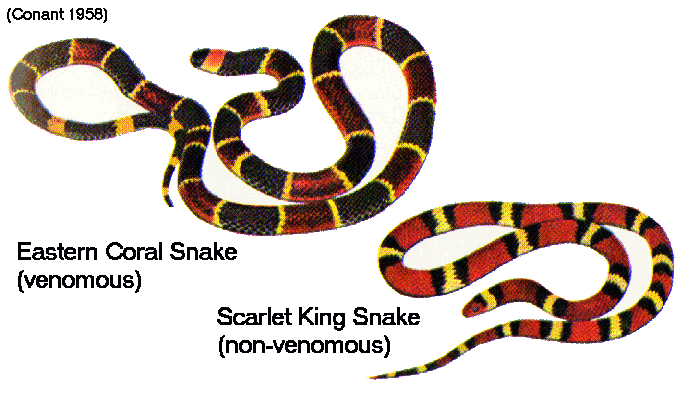
(Picture from http://www.mun.ca/biology/scarr/Coral_snake_mimics.gif)
These differences in color is what helps hundreds of people (including me) in America determine if a snake can kill them. But color is not only helpful in identifying snakes, it also identifies poisonous frogs. Not all colorful frogs are poisonous, but it's a safe bet. The poison dart frog is the most common, and is found in South America. The bright colors are warning signs to predators.
Colors are used not only to send signals to humans (like my red DANGER blog) but it also works in the animal kingdom. Except unlike our society, they are naturally prone to it. All species automatically recognize "bright colors are bad."
Want some proof?
http://www.surviveoutdoors.com/reference/snakes/coral_snake.asp
http://en.wikipedia.org/wiki/Poison_dart_frog
Wednesday, February 27, 2008
And How Does That Make You Feel?
Blue is used mostly for a calm, mellow color. In class when we all did the mood/temps blue was always used for calm/gloomy/bored/cold etc. I found some other common associations here (http://en.wikipedia.org/wiki/Color_symbolism_and_psychology) and wanted to put it to the test. Is the majority of people’s associations with blue calm/cold/trusting/sky/ocean etc?
So I went around asking a bunch of people, “what comes to mind when you think of the color blue?” to try to get an idea of where their emotion comes from. Then I asked, “what kind of mood/emotion do you get from the color blue?” to see if the general consensus matched my research.
Me: What comes to mind when you think of the color blue?
Chris: Sapphires, or better yet your eyes.
Me: My eyes are green smartass. What kind of feelings do you get from blue?
Chris: Oh. Calm.
1st question/2nd question
Mom: The Ocean/Warm and happy.
Matthew: Cold/Sad
Logan: Sky or Ocean/Calm.
Frank: Boy,Sky/Hopeful.
Emilia: Cloth. Pretty blue cloth/Calm, but almost a fake calm. A medicinal calm.
Sarah: Picasso blue period/Depression, cold.
Drajan: Sky. Your mom’s car. Water/Chill.
Harrison: Ocean/Calm.
Monty: A blue Mustang for some reason/Cool… like relaxed.
Christina: The sky and my friend’s mustang/Calm.
Vicki: Cold/Calm.
Answers I’m not going to count:
Tony: Death/Funderful.
Andrew: My eyes.
Me: You would. What mood/emotions do you get from blue?
Andrew: I’m a guy, I don’t associate emotions with colors.
Me: You’re a human being, therefore you do. What is blue to you?
Andrew: A color.
Matt: My hair.
Conclusion: A lot of people think about the ocean and/or the sky when they think of blue. But all of the results were found in the common associations with the color. The majority (2/3) did associate calm (chill, relaxed, etc) with blue which is not surprising to me since I always assumed it was the most common association. Or maybe because that’s what I associate blue with? Also, I need better, more cooperating, less stupid, less mustang-obsessive friends.
Thursday, February 7, 2008
Color Wheel
I have never worked with paint. I think the only thing I’ve ever used a paintbrush for was gel medium and fooling around with the chemicals in the darkroom. When I was buying the supplies I was kind of shocked at the different paints. I mean I assumed there were a lot of different kinds and colors, but to actually sorting through the odd names and ‘soft body’ or ‘liquid’ or whatever other kinds they had was crazy.
The biggest surprise to me was that the acrylic colors don’t mix perfectly. The green turned out fine, but I had always assumed if you mixed blue and red it would be the right shade of purple. Also, it dried so quickly I wonder how anyone is really able to paint with just acrylic. After class I talked with my Aunt (who is a fine artist) and she described to me how acrylics don’t mix well and how it’s usually best to use oils. She also told me how it’s easier with oils since you can always come back to the painting. I had never really thought down and thought about how frustrating it must be to paint with acrylics. I’m just glad I’m photojournalism and not a fine artist. I make too many mistakes, I’d rather waste photo paper than have to restart an entire painting because something didn’t blend or it dried too quickly.
The biggest surprise to me was that the acrylic colors don’t mix perfectly. The green turned out fine, but I had always assumed if you mixed blue and red it would be the right shade of purple. Also, it dried so quickly I wonder how anyone is really able to paint with just acrylic. After class I talked with my Aunt (who is a fine artist) and she described to me how acrylics don’t mix well and how it’s usually best to use oils. She also told me how it’s easier with oils since you can always come back to the painting. I had never really thought down and thought about how frustrating it must be to paint with acrylics. I’m just glad I’m photojournalism and not a fine artist. I make too many mistakes, I’d rather waste photo paper than have to restart an entire painting because something didn’t blend or it dried too quickly.
Wednesday, January 30, 2008
Color

As we went around taking the photos, I immediately noticed a lot of red everywhere. In the room there was the fire alarm, posters with gasmasks, and outside there were danger signs and other signs that used red to get attention. But the large majority of red I saw was for dangerous things. Red is a very intense, eye catching color so it makes sense to me that it would be used for signs that need attention (stop, danger, fire, etc) but also found it strange that the only non-threatening red thing we saw was a Coca Cola bottle. Again, the intense and eye catching characteristic make consumers see the bottle and be interested in buying it, but after paying attention to all the other uses for red, it almost seems like "danger, do not drink this." It is interesting to see the very different ways the same shade of color is used.

Another thing my group noticed with the colors are how they can be used to mimic what is being advertised. This pawn shop used green and gold, the colors of money. Instead of red to get attention, or a regular blue, they used the color of money so when people read the sign, they also get the color connection. Instead of the color expressing a mood, it is portraying what is being sold.
I had never noticed that color could be used for such different meanings in such different ways. I have always chosen colors based on what looked attractive to me, not for what mood I want to express or what I am representing. Now I understand color a little better and can start using it in a more thought-out way.
Thursday, November 1, 2007
Line Kit
This line something-or-other was very interesting. Parts of the piece turned out very well and geometric almost looking ordered, and other parts we're just very displaced. The piece itself was well designed as the 'kit' because all of the lines connected. I am really interested in seeing the one Pat mentioned that was in the Corcoran, because this idea worked out very well. I'm kind of excited to make my conceptual piece (even though I will definately get stares and possibly even a few security guards asking questions).
Subscribe to:
Posts (Atom)